THESIS PROJECT
THE PROBLEM
The Las Vegas Blizzard, a newly selected expansion team in the East Coast Hockey League’s Western Conference, needs a strong brand identity to differentiate the franchise in an oversaturated entertainment market (Perez, 2024).
THE SOLUTION
A visual branding package is needed to help create a unique selling proposition to attract and retain loyal fans through community engagement, via on-site events and digital/social media marketing, to increase single- and season-ticket and merchandise sales (Boehmer, 2025).
ONLYNESS OUTLINE
The initial Onlyness Statement began as an outline. The focus was only on people who were already fans of hockey and would be drawn by affordable tickets.
The benefit being promised is affiliation. The focus is on passionate, enthusiastic fans of hockey who want to feel a strong connection to their team and community. The ECHL is played in a smaller hockey arena with affordable tickets offering social interactions with like-minded fans, up-close action, and fun activities.
ONLYNESS STATEMENT
This version is concise yet includes a wider range of consumers to be included. It emphasizes the brand’s offering of a space and experience that will build community through activities, both in person and online.
The Las Vegas Blizzard is the only professional sports team in the Las Vegas Valley built around the need for affiliation and belonging. Newcomers and locals alike will discover a welcoming space to connect, celebrate, and become part of something bigger - whether through themed game nights, team hosted tailgating, or the Blizzard’s fan-centered app.
•
COME INTO THE BLIZZARD!
• COME INTO THE BLIZZARD!
The Blizzard is not just a team.
It is the fans, the staff, the structure where games take place. It is the third space where a community is built, informal conversation happens, new relationships are formed, and a new team gains a following (Butler, 2016).
VOICE & TONE

The voice for the Blizzard is inclusive and speaks as a group. ‘We’ are the focus, creating the feel of affiliation and camaraderie. Speaking in this style sets the tone, which invites those who are individuals who want to be included, welcomed, and celebrated (American Psychological Association, n.d.).
It never defines who is welcome – a fan doesn’t need to be a hockey fanatic to join. All that is required is an interest in joining the crowd to cheer on the team. Community outreach is key to build the fanbase, which brings people together and has a positive effect on populations from different backgrounds (Inoue, 2019).
BRAND NAME
EXPLORATION
FINAL CHOICE
Initial explorations for the team name were directed towards local animals. After an extensive search for an animal in the area that had not been used for another sports team, especially hockey, the Las Vegas Sidewinders was chosen. Sidewinder snakes have an unusual way of moving: they lead with their midsection and follow with their head and tail, leaving a J shape in the sand. This movement allows them to move very quickly across shifting sand, just like hockey players across the ice. They also have a fascinating horned structure on their heads, which would have made a formidable mascot for the team. Sidewinders, though, are solitary creatures, which did not support the team’s goal of fostering connection.
After considering the cold of the arena and the spray of ice kicked up by hockey skates, the name the Blizzard seemed appropriate. Blizzards are a force of wind and snowflakes that gather to envelope all in their paths. A blizzard cannot happen with one snowflake, though. It must be a gathering of forces to make a difference.
For the need for affiliation to be satisfied, more than one person must connect with others to form relationships, which can lead to the creation of organizations and social gatherings (American Psychological Association, 2025). A new team does not have a winning record or fierce rivalries to attract new fans, but it does have an offer of community and camaraderie that must be build in from the start (Peters, 2025).
LOOK & FEEL
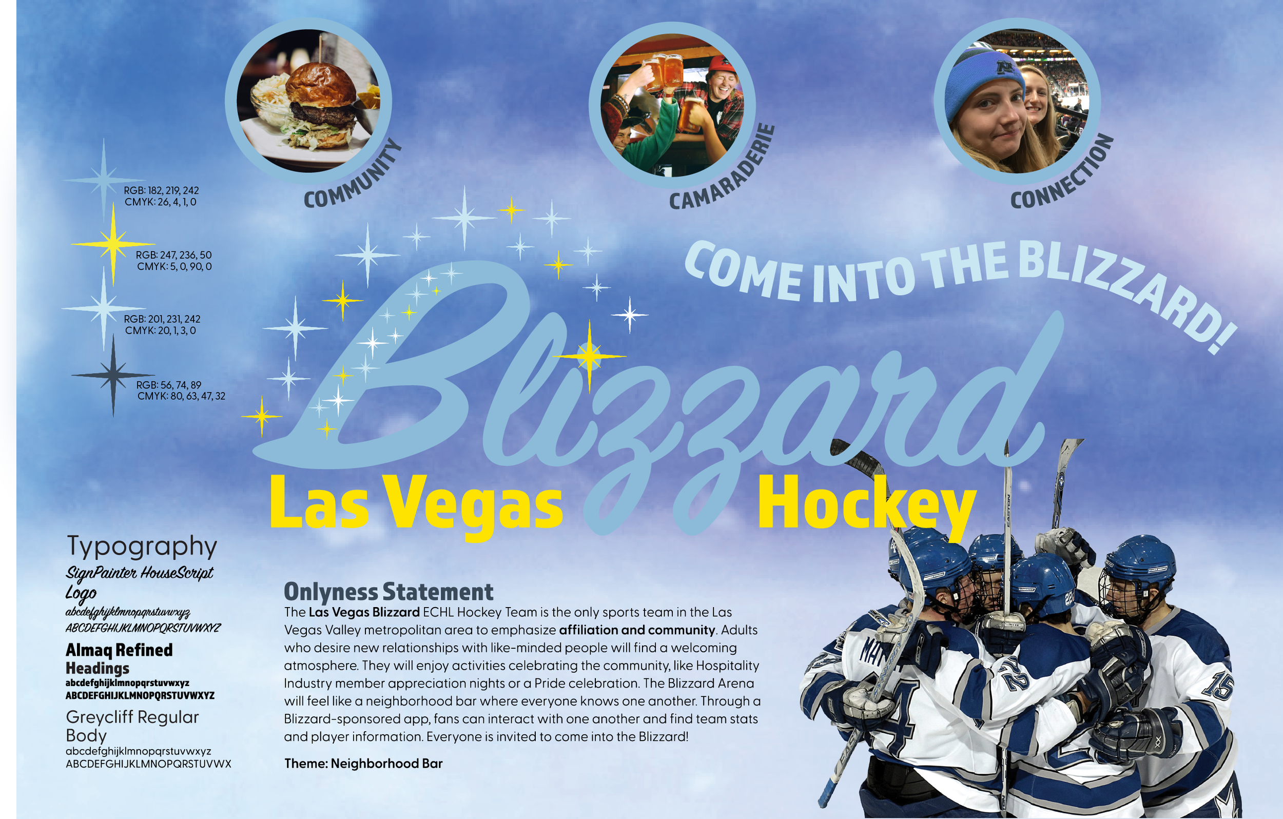
COLOR PALETTE
With a name like Blizzard, the palette needed to reflect the snow and cold produced by a meteorological blizzard, while also showing the connection to an ice hockey arena and team. As snowflakes gather, the light that passes through includes all the colors of a wavelength (like a rainbow), except the blue stays behind. When the ice is thick, the blue will be even more intense (Pike, 2010).
The shades of blue that were chosen represent the ice with different values, from a light blue to a very dark blue. Red was included as an accent color. It is a striking contrast, but in the end, it was not the correct color to represent a blizzard.
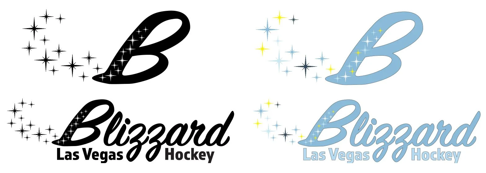
The yellow is the complimentary color of blue and is often used for representative stars in art. The color is named “Star” on ColorKit’s website (Color Picker, n.d.), and includes a little red and green. The darkest blue is used for all typography, instead of black. The lightest blue is an accent color, and the medium blue is the primary blue for the brand. The yellow is only used in the starflakes.
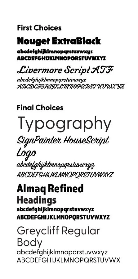
TYPEFACE
The initial typeface used for the name, Blizzard, was Nouget, a bold, sans serif typeface in the NeoGrotesk style. The letters feature an added spur that is angular, with a slightly softened corner. It was chosen for its angular shapes reminiscent of the blade on hockey skates. As the project developed, with the themes of community and camaraderie with a retro feel, it became apparent that the typeface for the logotype needed to represent something smoother, welcoming, with a nod to the mid-century style of Las Vegas in the 1950s, when the design styles centered around mid-century and Atomic age (Westgate Resorts, n.d.). Initially, Livermore Script ATF was considered, but the stylized swash caps were too formal.
SignPainter HouseScript has a friendly, cursive style that is easily read and looks like the swoops and scrapes left in the ice by skaters (until the game gets fierce). The double z in the word Blizzard has loops below the baseline right in the middle of the word creating a centering effect. The heading is Almaq Refined, a bold sans serif with a tall x-height. It is clear, clean, and compliments SignPainter. The body and subheadings are in Greyclif CF, an easily-read modern sans serif font.

LINE
The original idea for the line for the project was angular, like hockey skate marks and the aggressive movements of the players.
After SignPainter became the typeface used in the logomark, the lines became more curvilinear, with swirl patterns for the starflakes and a broad swooping line in the website landing page and stationery. It is a welcoming, inclusive line that reinforces the need for affiliation. It also echoes the Googie architectural style prevalent in Las Vegas in the post-World War II era (Carlson, 2023), with bold, soaring curvilinear lines.
SHAPE
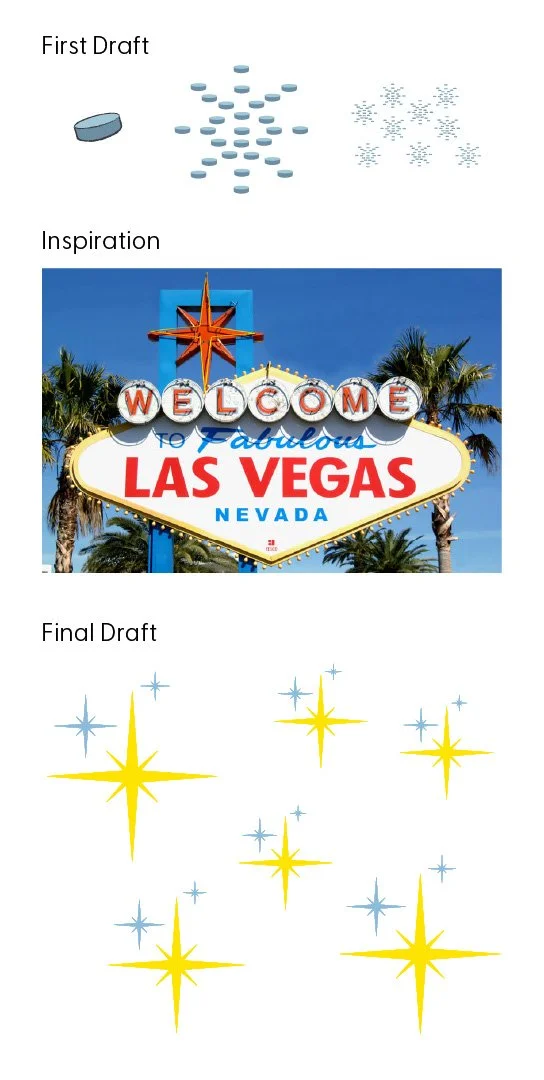
The first snowflake was made out of hockey puck shapes. They were placed along the lines of a snowflake shape. This was not successful, since the details were lost when reduced in size.
The shape that came to represent the Blizzard is the starflake, which is based on the eight-pointed star shape found on the “Welcome to Fabulous Las Vegas” sign (SmartSign, n.d.). The Googie architecture-inspired sign was in style in the 1940s and 50s, which was influenced by futurism, the Atomic age, and car culture (SmartSign, n.d.). Also called a Star of Bethlehem, it is an invitation to the bright, shiny, starstruck world that is the Las Vegas Strip (Castillo, 2024).
The moniker “starflake” was created to combine the eight-pointed star with the snowflakes that build into a blizzard. Starflakes are meant to be grouped together with no less than 3 in the group. They can be straight up and down in their official capacity as part of the logomark, but are strewn in various angles when presented as a background or as part of a swirl.

TEXTURE
The background for most of the Blizzard pieces is a detail from a photograph of a hockey player spraying ice in an arena filled with hazy blue and purple lights (Arapovic, n.d.). The image was manipulated to even out the range of values. It gives the atmosphere of an icy rink, without the details.
The starflakes also create texture as a background. They are usually around the edges of a defined space, like the perimeter of the website pages; or slightly visible behind a space that has a reduced opacity, like the Bar & Grill section on the website.
IMAGERY
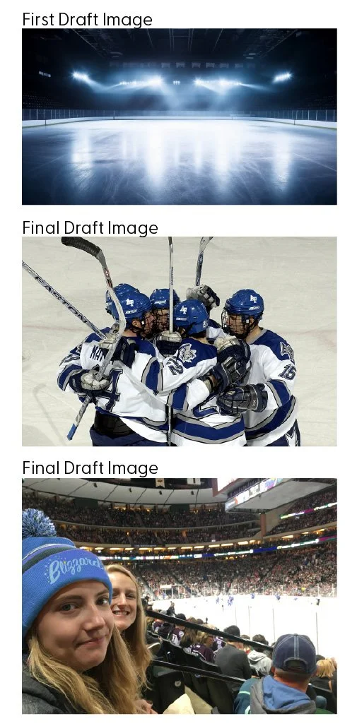
The first images gathered for the project were of icy landscapes and solitary, cold ice rinks. The imagery was too solitary and unwelcoming.
The need for affiliation needed to drive the images in all aspects of the visual designs for the Blizzard. Fans and hockey players must be shown in groups of two or more. Arenas must be shown with fans present. Scenes in the bar & grill must include multiple diners, servers, or bartenders. The people featured should be excited or joyful, in a celebratory mood. Images of food and drinks should also feature multiple items to show that the offerings are plentiful.

VISION BOARD
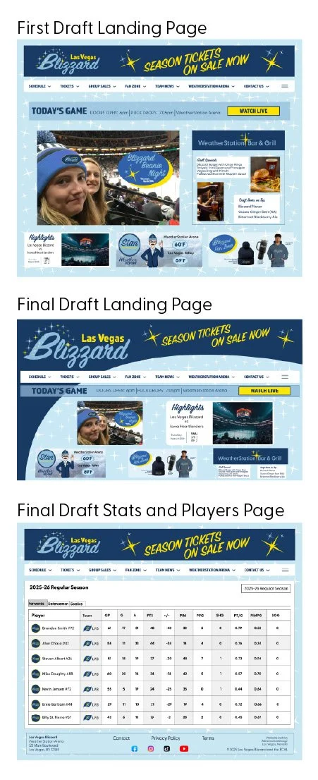
FIRST DRAFT
The first vision board created for the Blizzard has a background that is enlarged from a photo of a hockey player spraying ice. The image is filled with varying degrees of values and shades, which made the elements difficult to view. The placement of the elements was haphazard and did not lead the eye through the information. The images were not consistently placed or presented. The body text did not have a typographical hierarchy that organized the information.

FINAL DESIGN
The background was manipulated to even out the varied values and shades. The final logo replaced the first draft. Images were resized and framed in a consistent style. Visual hierarchy standards were followed which now directs the eye through the information.
LOGO DESIGN
CONCEPT
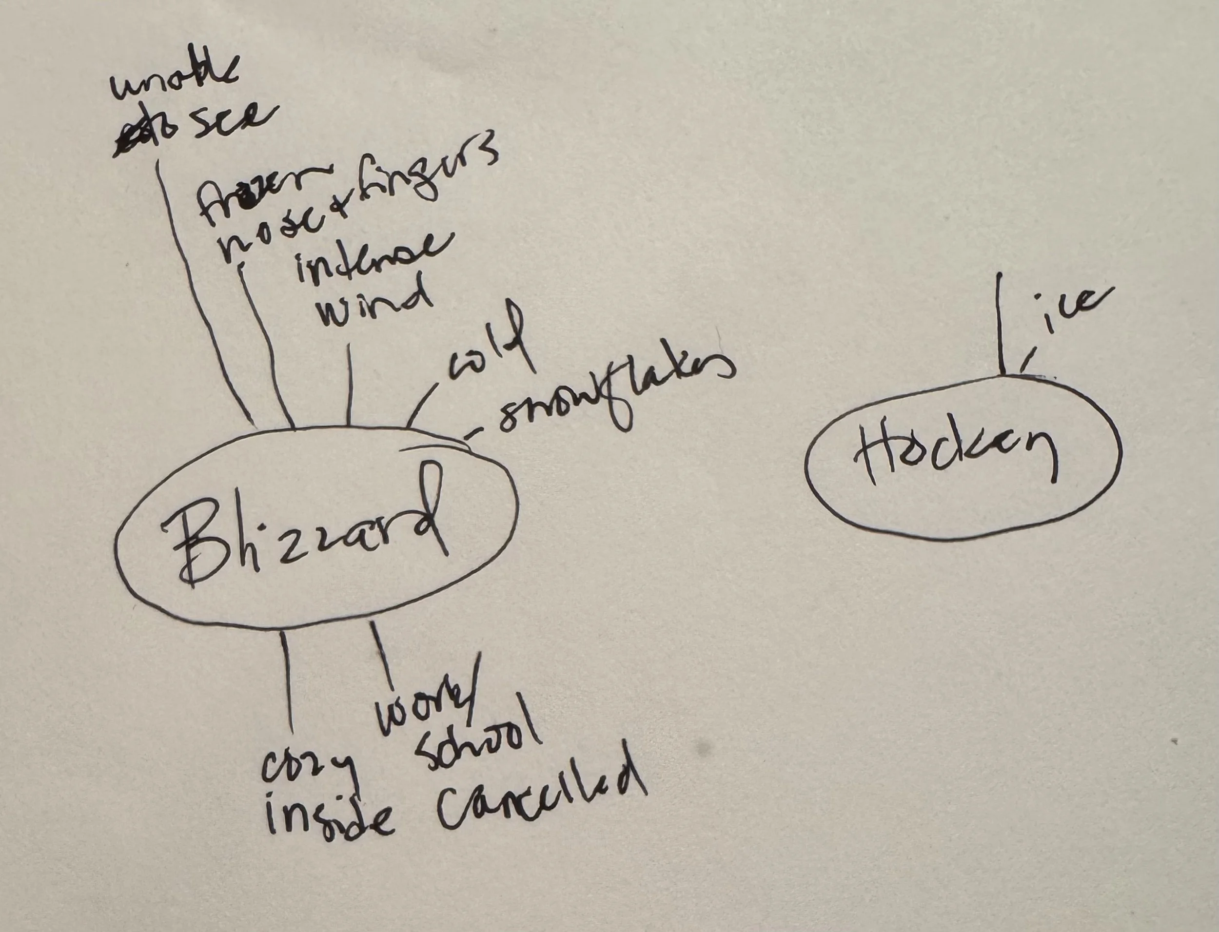
The ideation phase began with a quick word association sketch. “Blizzard” was associated with “frozen nose and fingers,” “intense wind,” and “snowflakes,” but also lead to “cozy inside” and snow days with “work or school cancelled.”
Then research was conducted into items and words that symbolize the Las Vegas area (Kearns, n.d.). Nevada is known as the Silver State, so a logo sketch used mined silver, as well as a silver coin. The land on which Las Vegas is built is Southern Paiute tribal land, which used a shape inspired by a traditional Paiute ceremonial basket (Arthur Erickson, n.d.).
The pattern created by a meteorological view of a blizzard from above was used as a template for a symbolic whirlwind of clouds. The consistent themes that kept appearing were swirls and the Googie-inspired, eight-pointed star (SmartSign, n.d.), along with items associated with cold and snow, like winter beanie-style hats and a snow globe.
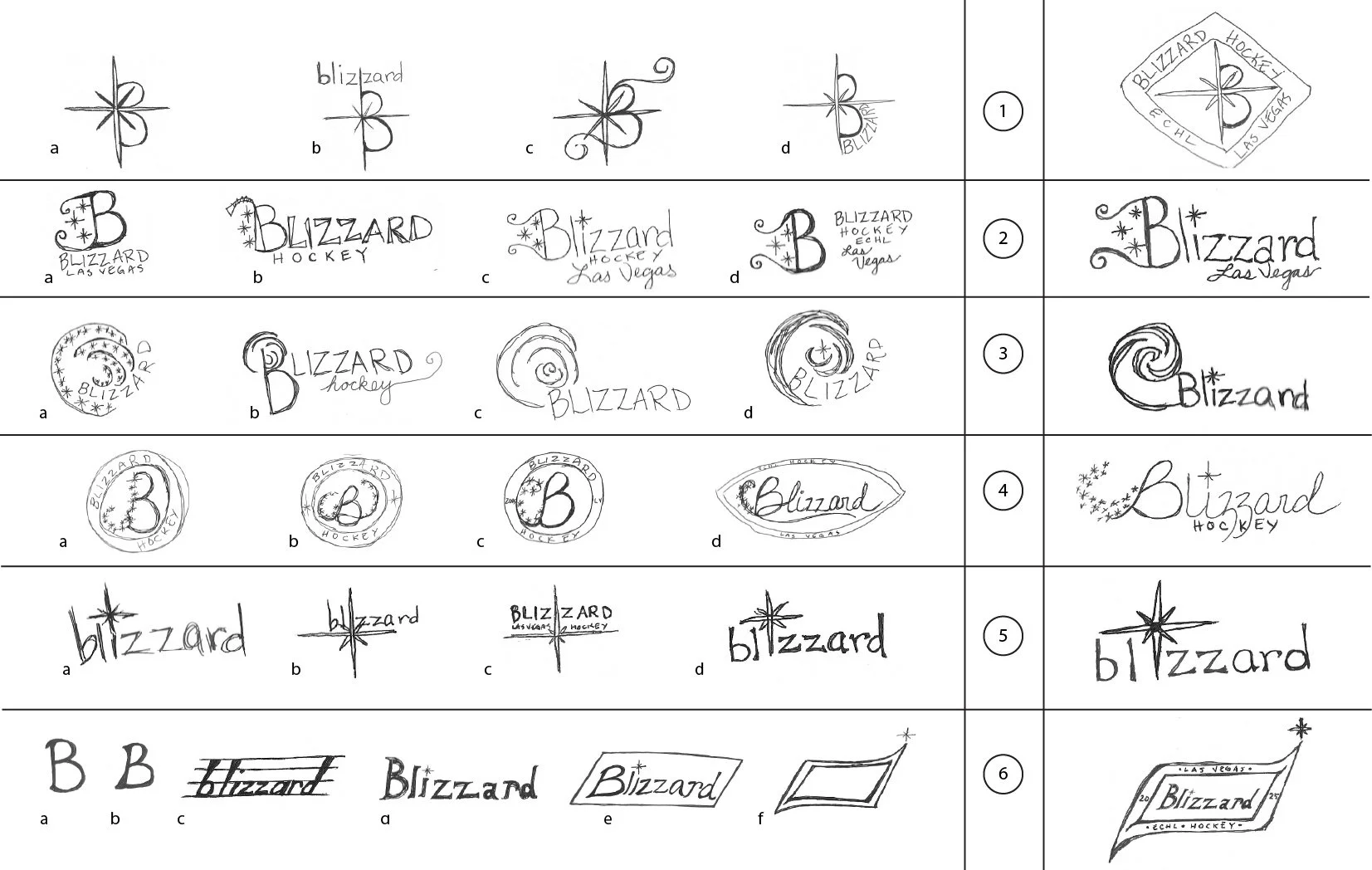

SELECTION
Since the star and swirl became a consistent feature in sketches, these elements were explored further. The star’s particular structure had four long points, offset by 4 short points. It was used as the main element that used the center of the star as the long edge of a capital B. This created an unbalanced form, especially if centered in a badge-style logo. The star was also incorporated into the word Blizzard, either as the dot on the ‘i,’ replacing the ‘i,’ or separating the double z in the middle of the word. This was eventually incorporated into the final design in more subtle fashion.
The storm swirl was incorporated into a design that enveloped the word Blizzard or became part of the B in Blizzard. While it was a visually interesting choice, it ultimately didn’t represent affiliation. Another sketch included swirls as filaments on the initial B in the word Blizzard.
Various shapes were used to surround the word or first letter of Blizzard, with starflakes swirling in or as a tilted rectangle. Elements of this were used in the final design.
REFINEMENT
The swirl of starflakes leading up to the first letter, B, was long and unbalanced the logo. So, the swirl was moved closer to the beginning tail of the B and swooped over the top, as well as incorporated into the long edge on the left section.
One of the starflakes was placed on top of the dot of the ‘i’ with a fill of yellow to give it an accent. The words “Las Vegas” and “Hockey,” previously tinted in a lighter blue, were tinted yellow for contrast.


FINALIZATION
The placement of “Las Vegas,” if alone, unbalanced the logo. It was moved to the top right over Blizzard and nestled in to fit below the height of the ‘B.’ “Hockey” remains in the same space, if needed.
Logomarks were created in the style of a badge with the letter “B” in a stylized badge reflecting a shape reminiscent with the Atomic age. Round badges were created for social media profile pictures; one has the “B” with starflakes and another has a set of three starflakes.
MEDIA ASSETS
UNIFORM
The team uniforms for ECHL teams are more playful than NHL teams, which can be a draw for fans (Blackburn, 2017). The players still play serious hockey, like their NHL counterparts, but creating events for the games helps draw fans.
The standard uniform created for the Blizzard includes all of the required elements, includes the starflakes in an organized pattern on the bottom edge and sleeves of the jersey, and a playful pattern on the shorts. Badge with the player’s number is the same design as the team badge. The font, Almaq Refined, is used for all text, including the player’s name and number.


STATIONERY
A set of stationery was created for business operations. The business card features a thick yellow edge. The front is a full version of the logo. The name side features a swooping edge of blue, starflakes, and contact information.
The letterhead features the same swoop of blue along the left upper corner, with team name and contact information. The white space includes some starflakes for decoration.
The business envelope has the same swoop of blue and contact information, with a light and dark blue background with a badge on the flap. A detailed interior offers a continuation of the starflake theme to capture attention and create a fully integrated design experience.
BILLBOARD
The billboard designed for this project is a teaser to promote the team before it is officially announced to Las Vegas. It features a swirl of starflakes, blowing in like the beginning of a blizzard. The main text reads “Blizzard’s a-comin’” to introduce the team name. The language is an idiomatic way to announce an impending storm, with a nod to the pioneers of the old west and the frenzy of knowing a big storm is on its way.
The first draft had a smaller call to action along the bottom of the billboard. The type size was too small for drivers to read while speeding past, so the size was increased and the two lines stacked.
On the final draft, the calls to action are on the lower left side, which include an invitation to buy tickets and the name of the website. Initially, the calls to action were smaller and along a straight line. This would have made it more difficult for a driver to read. The lines were stacked and moved to the left side as the last thing the drivers sees. The white of the main text shines out against the dark background gradient of pale to vibrant starflakes.


SOCIAL MEDIA
Facebook, TikTok, and Instagram pages were created. The Facebook page uses a small circular logo for the profile picture and a photo of the team celebrating for the banner. The story section includes links to the Bar & Grill, Stan the Weatherman, and game highlights.
The Instagram page has similar links, along with a link to fan gear. Instagram shares updates that are current and share the action on the ice. TikTok is for fan engagement. Fans can share their TikToks on the LVBlizzardHockey page, connect with other fans, and find announcements about fan engagement events.
WEBSITE
The ECHL created a new league-wide website platform for the 2023-24 season to provide a consistent experience for all teams in the league. Through a central website and social media platform designed by Patchboard, the team can personalize the website visually, but the statistics are pulled from the same database (ECHL, 2023).
The website’s landing page continues the visual design that includes the same swoop of blue from the stationery. The call out texts use SignPainter for the call to action to buy season tickets. The images include multiple fans gathered at games. Game information is at the top with a link to watch a live game.
Stan the Weatherman announces the temperature inside the arena to encourage fans to wear their cold weather gear, like the Blizzard Beanie and cozy sweatshirt. The latest menu and beer list from the WeatherStation Bar & Grill is listed. The second page is drawn from the information provided by the league’s database and is similar to other ECHL teams.
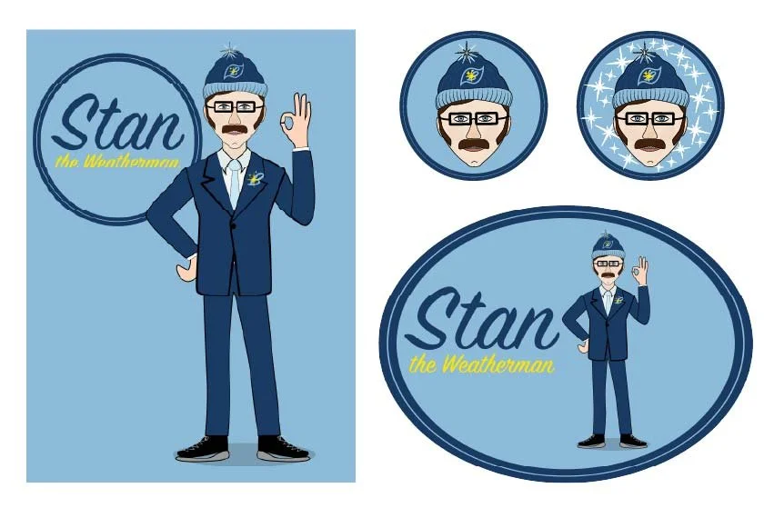
MASCOT
The mascot started out as a caricature of a weatherman with thick, squared-off glasses, a big mustache, and sideburns like Elvis as a nod to Las Vegas entertainment.
Stan the Weatherman keeps fans apprised of the temperature inside the WeatherStation Arena on his TikTok page, since it will inevitably be colder inside than it is outside. He wears a suit and tie, along with a Blizzard Beanie.
He will be present at all Meet-and-Greet events, as well as on the ice when the team is not in play and wandering around to interact with fans during the game.
There are t-shirts available with Stan the Weatherman that fans, especially young fans, can take on vacation. If the fan has their picture taken with the Stan the Weatherman t-shirt on, they can post it on the TikTok site and Stan will interact with them personally.
MERCHANDISE
The Blizzard logo is available on sweatshirts, t-shirts, and mugs. Fans are encouraged to wear the Blizzard Beanie to show their support to their team. Stan the Weatherman gear is also available. Fans are encouraged to snap photos wearing Blizzard and Stan the Weatherman clothing while traveling around, which can then be posted on the Blizzard TikTok page.

References
American Psychological Association Dictionary. (n.d.). Need for affiliation. APA Dictionary. Retrieved 2/23/25. https://dictionary.apa.org/need-for-affiliation
Arapovic, B. (n.d.). Ice hockey player in action. Vecteezy. Retrieved on 5/17/25. https://www.vecteezy.com/photo/11923741-ice-hockey-player-in-action
Arthur Erickson. (n.d.). Southern Paiute bottleneck basket. Arthur Erickson Old Native Arts & Unusual Antiques. Retrieved on 5/24/25. https://arthurwerickson.com/products/paiute-bottleneck-basket
Blackburn, P. (2017, Jan 5). ECHL team unveils ridiculous ‘Rocky’ themed uniforms. Fox Sports. Retrieved on 5/24/25. https://www.foxsports.com/stories/nhl/echl-team-unveils-ridiculous-rocky-themed-uniforms
Boehmer, J. (2025, Feb 11). It’s all about community: How new niche sports franchises can create highly engaged fans that are willing to pay more. Taylor & Francis Group. Retrieved on 5/20/25. https://www.tandfonline.com/doi/full/10.1080/16184742.2025.2462643#d1e762
Carlson, E. (2023, May 18). Googie architecture: Space age themes shaped ‘modern’ style. Astronomy.com. Retrieved 2/16/25. https://www.astronomy.com/observing/googie-architecture-space-age-themes-shaped-modern-style/
Castillo, R. (2024, Mar 16). What is Las Vegas know for? Get to know Sin City. Redfin Blog. Retrieved on 5/8/25. https://www.redfin.com/blog/what-is-las-vegas-known-for/
Color Picker. (n.d.) ColorKit. Retrieved on 5/21/25. https://colorkit.co/color/ffe300/
ECHL (2023, Oct 3). ECHL launches new website platform. ECHL News. Retrieved 3/30/25. https://echl.com/news/2023/10/echl-launches-new-website-platform#:~:text=%E2%80%9CThis%20uniformity%20will%20allow%20fans%20to%20seamlessly,working%20with%20the%20ECHL%20to%20create%20a
Inoue, Y. (2019, Apr 2). Building community through sport. University of Minnesota Newsletter. Retrieved 1/19/25. https://twin-cities.umn.edu/news-events/building-community-through-sport
Kearns, P. (n.d.). 50 things you probably didn’t know about Las Vegas. Movoto. Retrieved 2/5/25. https://www.movoto.com/guide/las-vegas-nv/las-vegas-facts/
Pike, S. (2010, Jan 27). Why is the snow ‘blue’? Seacoastonline. Retrieved on 5/21/25. https://www.seacoastonline.com/story/lifestyle/2010/01/27/why-is-snow-blue/51726508007/
Perez, A. (2024, Apr 16). Before it was a major sports city, Las Vegas became a ‘Hockey Town.’ Front Office Sports. Retrieved on 5/20/25. https://frontofficesports.com/before-it-was-a-major-sports-city-las-vegas-became-a-hockey-town/
Peters, S. (2025, May 23). WNBA franchises are a slam dunk in this iffy economy. Marketplace. American Public Media. Retrieved on 5/24/25. https://www.marketplace.org/episode/2025/05/23/wnba-franchises-are-a-slam-dunk-in-this-iffy-economy
SmartSign. (n.d.). A short history of the ‘Welcome to Fabulous Las Vegas’ sign: Second in a SmartSign blog series on famous signs and their origins. Retrieved 2/9/25. https://www.smartsign.com/blog/short-history-welcome-fabulous-las-vegas-sign-second-smartsign-blog-series-famous-signs-origins/?srsltid=AfmBOor-62I3Jo0E1rTwAlbuAp8x90uOmHgXTN5nYGZtAfWd0LhIhdLl
Westgate Resorts. (n.d.). Las Vegas history: A complete guide. Westgate Resorts Blog. Retrieved on 5/24/25. https://www.westgateresorts.com/blog/las-vegas-history/