Feedback & Assessment
Brand Benefits
ONLYNESS STATEMENT
Feedback Received
Creating the Onlyness Statement started with answering questions about what benefit the brand will offer by solving the need for affiliation, as well as to whom it is being offered. The initial statement narrowed the group down to “passionate, enthusiastic hockey fans” who would enjoy a “social interaction with like-minded fans, up-close action, and fun activities.”
Professor Bartley Argo, course director of Design Strategies and Motivation at Full Sail University, suggested that the solution need not be limited to a specific group of people.
Original list of Brand Benefits

He said, “If anyone has a need for affiliation, this brand might speak to you.” It is the most basic, simplistic answer, he stated. People who are new to the community, who lack close relationships, may be interested in this brand.
“Think beyond the stereotypes” because it’s about the “power and importance of psychographics over demographics,” according to Professor Argo. “Always think about the need.”
Evaluation & Action Taken
The feedback helped create a focus for the entire project. Affiliation is defined as the desire to form relationships with other individuals, which can lead to the need to join organizations and attend social gatherings (American Psychological Association, 2025). People who attend sporting events with large groups feel a sense of connection to other fans, as they cheer and commiserate over
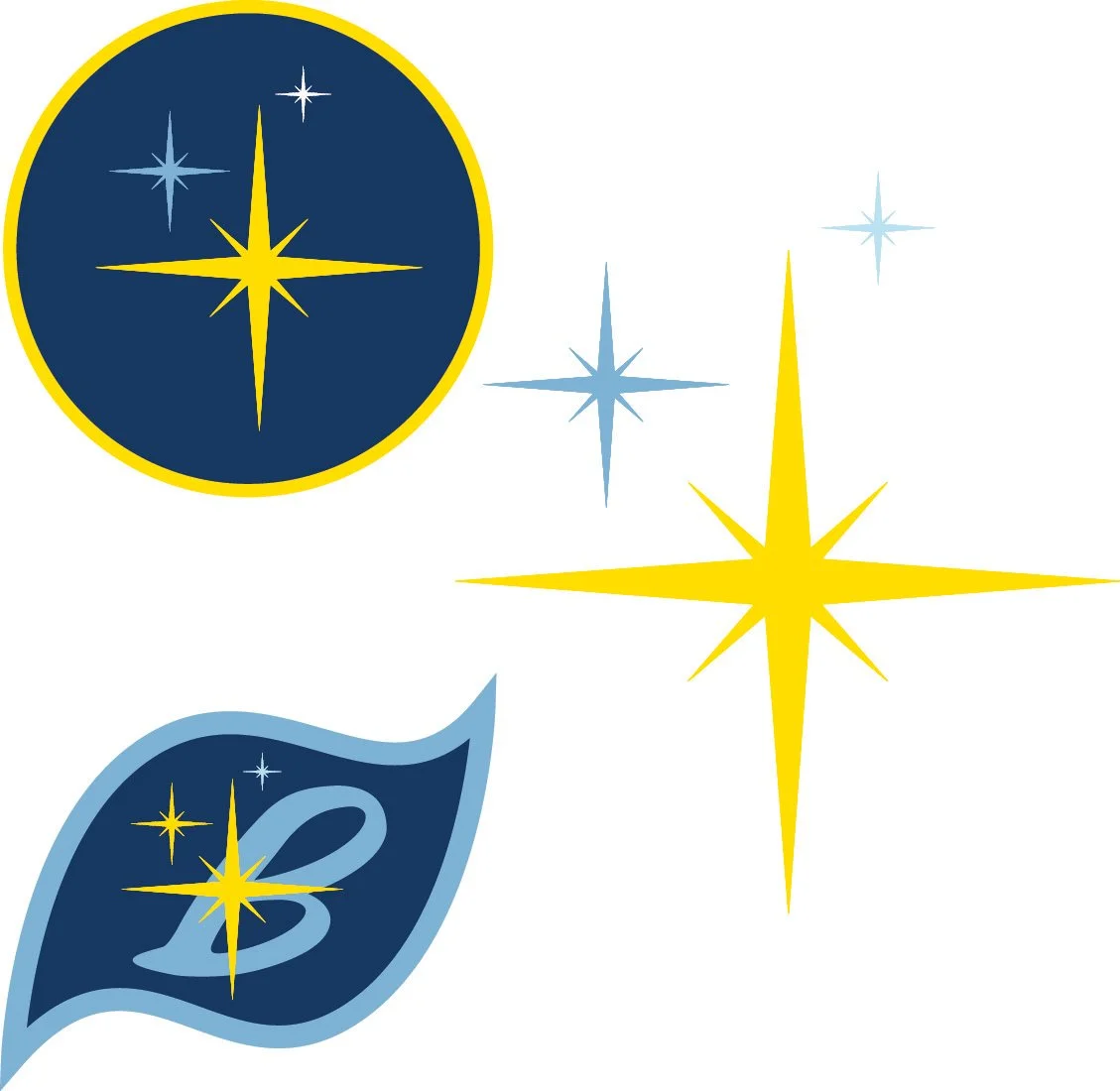
All assets were created with this need in mind. The Onlyness Statement now states that those who “desire new relationships with like-minded people”. The starflakes cannot appear singularly. They must be in a group of at least three. Fans and staff must appear with another person. The language of the brand is “we,” referring to a group that includes the speaker.
Final Onlyness Statement

Team Name
Feedback Received
Initially, the team’s name was chosen to reflect the area surrounding Las Vegas. Sports team names or nicknames are often a local animal, especially one with a fierce nature. “The Sidewinders” was one of the choices. Sidewinders are snakes that are indigenous to the desert areas of Nevada. Their movement, an S-shaped sideways slide, mimicked the moves hockey players make during a game.
Evaluation &
Action Taken
This discussion prompted much thought and consideration. The name symbolized the snow that comes with a blizzard, the cold associated with hockey, and the flecks of ice when a hockey player stops on the rink. It also could represent the joining together, in full force, the fans and players, to win the hockey game. This was the direction the project needed to support the need, affiliation.
Professor Argo suggested that the name did not match the need for affiliation. Sidewinders are solo animals. Affiliation creates a group of people who form a community. A new name, the Blizzard, was chosen, with the theme of a neighborhood bar like Cheers, the TV show (Miles, n.d.). Professor Argo said the theme was a strong one, but the name, Blizzard, doesn’t fit with affiliation.
Affiliation creates a group of people who form a community. A new name, the Blizzard, was chosen, with the theme of a neighborhood bar like Cheers, the TV show (Miles, n.d.). The patrons of the bar, especially a character named Norm, were greeted warmly when entering the bar. Those who frequented the bar formed friendships, which were supportive and welcoming. Professor Argo said the theme was a strong one, but the name, Blizzard, doesn’t fit with affiliation.
A decision was made to have the name of the team become the name for the whole project, like the name of a bar.
The team, the fans, the staff, the arena – all are the Blizzard. A snowstorm like a blizzard is comprised of millions of snowflakes which is forceful when combined. A community is created when all of the participants come together, like snow during a blizzard. Sporting events bring a connection to the community created by a common attachment to a team (Inoue, 2019). A psychological attachment forms between friends and fellow fans during a game. The fans also feel a fellowship with the team by getting to know their stats and watching them play. This has a positive effect on diverse groups of fans.
Elements
Feedback Received
Snowflakes are the logical symbol for a team named the Blizzard. The initial design was comprised of hockey pucks placed on the spokes of a snowflake shape. The initial design didn’t connect to the location of the team, Las Vegas, nor was it an attractive design.
Initial design for snowflakes

The 8-point star on the top of the sign was the inspiration for the snowflakes, now called “starflakes”. The Googie style architecture and mid-century design trend was incorporated to reflect the association with Las Vegas (Carlson, 2023).
Evaluation & Action Taken
The team is based in Las Vegas, so it made sense to base the design around the dynamic, iconic city. The shapes in the “Welcome to Fabulous Las Vegas” sign were inspiration for the design (A short history of the ‘Welcome to Fabulous Las Vegas’ sign, n.d.).
Starflake - final design
Logo Concepts
Feedback Received
After the 30 initial sketches, they were narrowed down to 5 sketches to be considered. Many contained the starflake shape, which was becoming a recurring theme in the visual branding. Dr. Adam Baldowski, course director of Design Integration at Full Sail University, on including the starflakes in the logo concept sketches, stated that they should not look like “dandelion fluff”. The lower loops of the “z” should not be separated, which was included in the sketch with the most promise (4). In the concepts with the starflake in the middle (1a), the B was not clearly visible. The storm swirl (3) was interesting, but a storm pattern is not as connected to Las Vegas as a starflake.
Logo Sketches
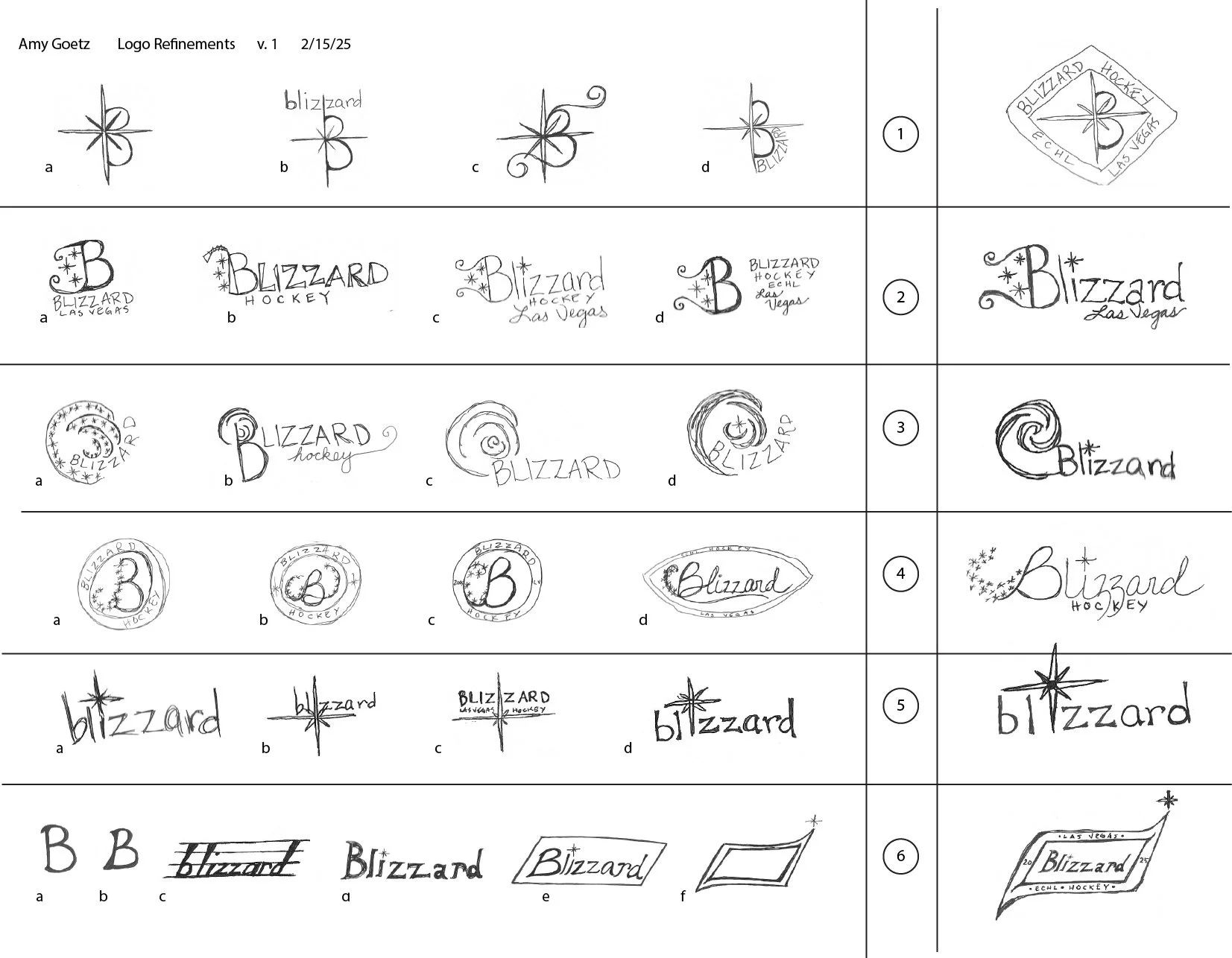
The starflake dotting the “i” in another line of sketches was added to the name, as was the looping of the “zz”. A new typography was chosen to match the swirl style. The logo now captures the style of vintage Las Vegas, while maintaining the “cool” of the snowflakes. Hockey arenas are always cold and attendees can be reminded of that just looking at the logo (Are hockey games cold? A comprehensive temperature guide, 2025). Starflakes and the icy blue colors are reminders of the cold. People from warm climates don’t necessarily have cold weather gear, so warm Blizzard Beanie knit hats and cozy sweatshirts are part of the merchandise offerings to keep fans warm.
Evaluation & Action Taken
Dr. Baldowski’s assistance in choosing the right elements from the various sketches helped the formation of the logo. The starflakes needed to be designed more clearly to not look like “dandelion fluff,” which has not been the intention. The design remained the same, though.
The resulting logo pulled together elements from several preliminary sketches. The uppercase B was embellished and starflakes were added along the outlines.
Initial Logo
Logo Refinement
Feedback Received
The logo design, in one of the early iterations, contained outlines around the text and shapes. Professor Andrea Kratz, course director of Multi-Platform Delivery at Full Sail University, pointed out that the outlines add complexity to the design and may not remain consistent when sized larger or smaller. Another point of feedback was that the first yellow chosen was too pure, too electric and will not show up very well. A yellow with some red added will be more visible.
Elements Outlined & Original Yellow

Evaluation & Action Taken
Upon reexamination, the yellow was not clearly visible and was a mismatch for the retro theme. The outlining of the text and objects was done initially to help them stand out against a variety of backdrops.
The outlining was removed and indeed created a crisper, more legible design. The yellow was changed to add a little red and green, which was more appropriate for the vintage style (George, n.d.). It is now more legible.
Final Logo

Embellished B
Feedback Received
The first letter of the team’s name, B, in the early iterations of the design had a long tail, swirling up to the main part of the B. Professor Broc Baird, former head of the graphic design department at McMurry University, suggested that the swirl was too ornate and too long for the design. The swirl needed to be streamlined for legibility.
Long embellishment

Evaluation & Action Taken
The swirl into the B was based on a swirling blizzard, so it seemed to be a key element. On further consideration, the starflakes could represent the swirl of the snow, while still evoking a mid-century aesthetic.
The extended swirl was shortened into a compact stroke that introduces the B. The starflakes trace the outline of
New Starflake arc over B

the B into a swirl over the top, ending at the starflake on the dot of the letter i. Starflakes were also added to the long edge of the B. The longer tail of starflakes on the B woud have increased the space required for the logo, whether it is a single B or the full name. The starflakes swirling over the logo moved the eye forward, whereas the tail of starflakes moved the eye backwards.
Badge Logo Mark
Feedback Received
The badge created as an additional logo mark using a two-pointed badge with a small bend at the points in the first iteration. Feedback from Professor Baird encouraged reshaping the edge into a shape more consistent with mid-century modern design, as had been used throughout the visual design.
First badge style

the B or the starflakes, depending on the usage (Anglingdarma, 2025). Atomic age design included space travel and celestial shapes. The sharp angle of the ends of the badge, paired with the curvilinear edges look like a molecular or amoebic shape.
Evaluation & Action Taken
In early sketches in the logo creation process, there had been drawings reflecting the mid-century design style. A return to that style would fit with the visual design style of the project.
The oval was reshaped into a two-pointed oval with a deeper twist to each end, creating an atomic era shape to surround
Final badge style

Vision Board
Feedback Received
The layout for the first version of the vision board was presented to Professor Argo, Dr. Baldowski, and fellow student, Adam Rodriguez. Because of a mid-toned background, elements were difficult to see and read. The elements were tight, compressed, and lacked cohesion. The background needed to be manipulated to allow the information to be legible.
First Vision Board

The background “noise” was greatly reduced and lightened, which made the darker font more legible. The elements were arranged to allow for white space, making the information easy to read. The blue borders and consistent size of the images unified the examples.
Evaluation & Action Taken
The background is from a photo of a hockey rink with a player spraying ice (Arapovic, n.d.). The white of the ice, as well as the mid-toned blues and purples made it difficult to choose the color of the font and if it should be light or dark. The feedback showed the need for a redesign, while the spirit of the design remained.
Final Vision Board

Billboard Call to Action
Feedback Received
The billboard serves as a teaser for the arrival of a new ECHL hockey team. The call to action was at the bottom right of the billboard and was small. Feedback from Professor Kratz noted that drivers would not be able to read the Call to Action at that size before driving past.
First Billboard
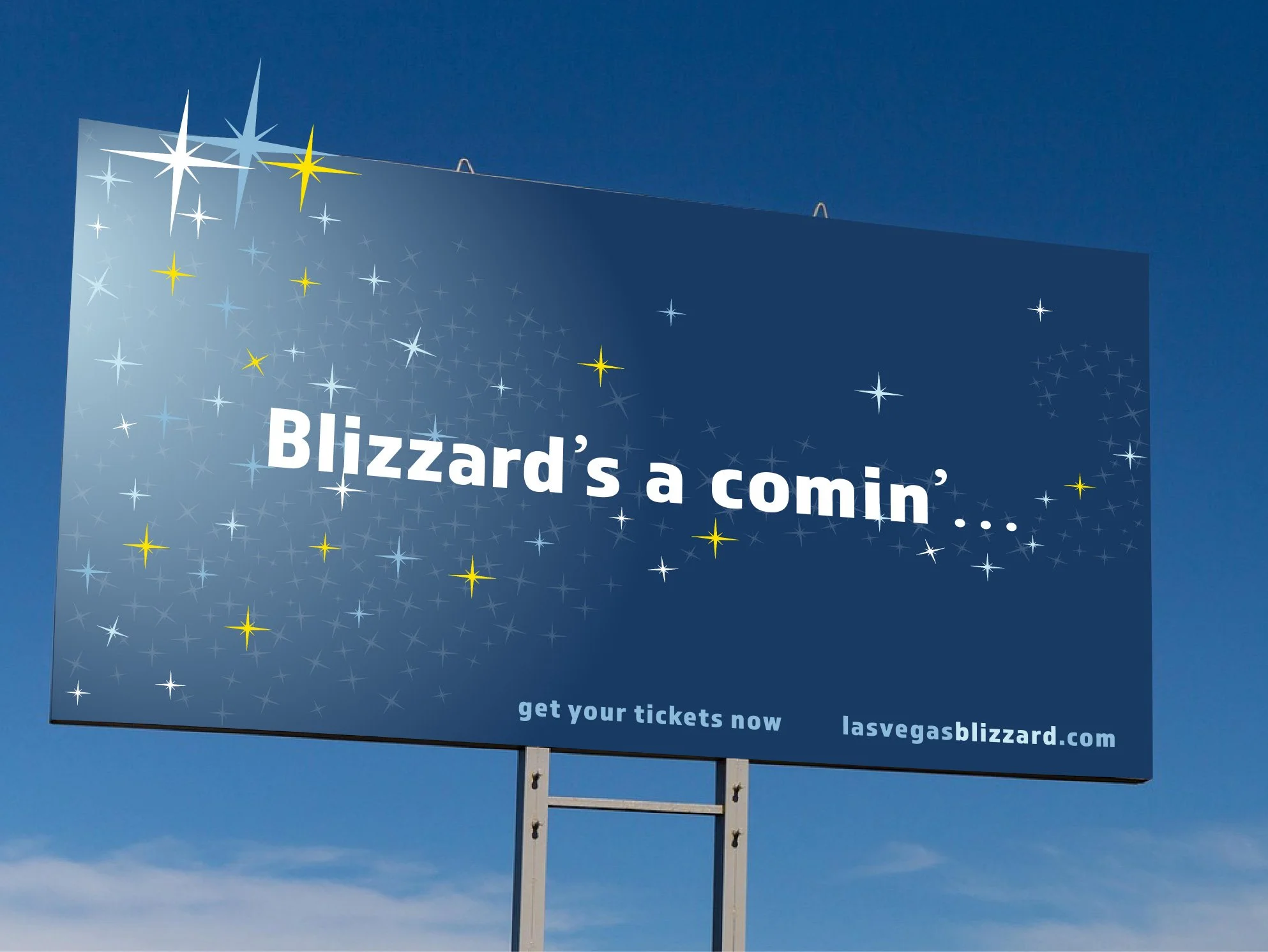
read at a distance of 100 feet, but that only allows for one second to read and understand the information.
The font for the Call to Action was increased to a size that would be readable at a longer distance away. Then the two lines were stacked one on top of the other for faster scanning.
Evaluation & Action Taken
This reminder to ensure the readability of information on a billboard prompted a search on specifications to be used in the design. A blog from Meadow Outdoor (The effect of fonts on readability: How distance influences read, n.d.) lists the reasons for certain font heights and styles, specifically listing the drive time and distance to read different heights. A smaller font must be
Final Billboard

Billboard Tagline
Self-Assessment
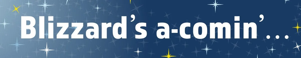
The tagline on the billboard, “Blizzard’s a comin’,” is meant to tease the Las Vegas area that something is coming to the Las Vegas area. The ECHL Las Vegas team is a new expansion team, therefore unknown to the community. Part of the history of the area includes cowboys who often spoke in short, meaningful sentences. In movies, they often had an accent which would add
First Tagline
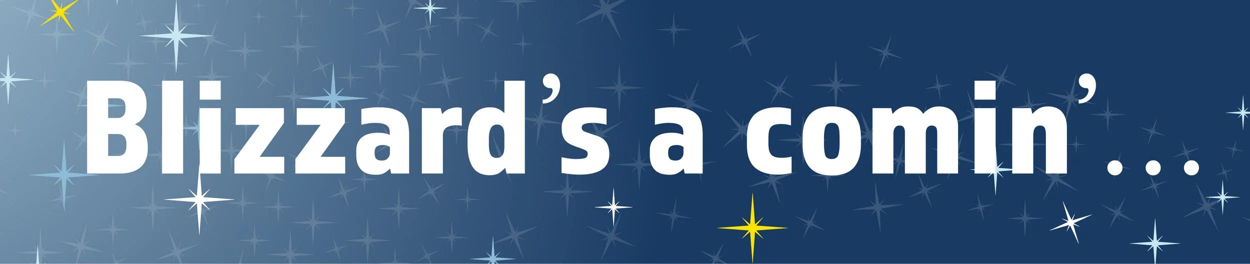
a sound at the beginning a word, called an epenthesis (Nordquist, 2025). The original tagline had the “a” alone, which would be an indefinite article. In order for it to be an epenthesis, the “a” needed to be attached to the word “comin’” which was already foreshortened as informal speech. Adding a dash between the “a” and “comin’” makes it one word.
Final Tagline
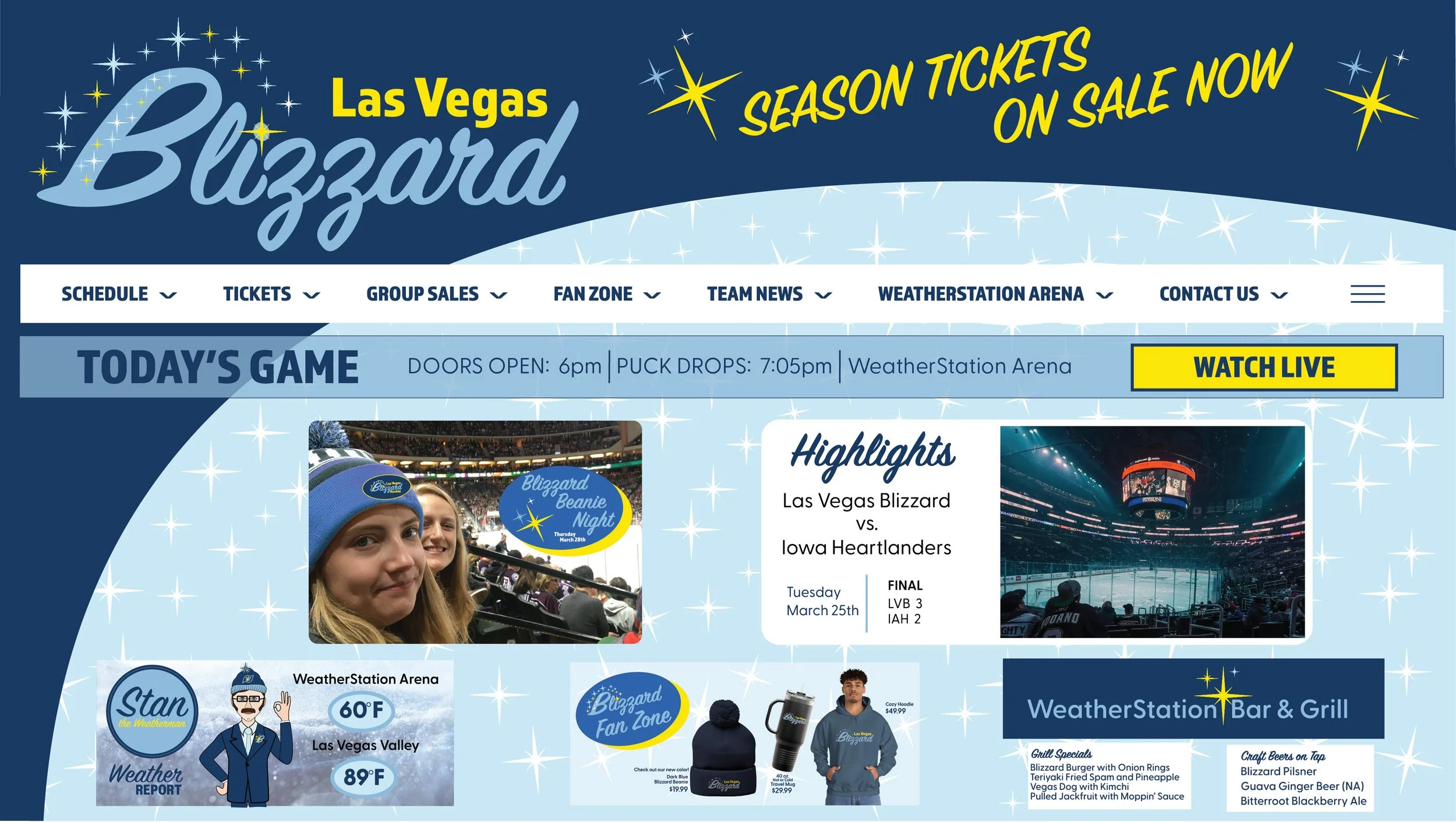
Website
Self-Assessment
The original version of the website included the information required by the ECHL as part of their new website platform introduced in 2023 (ECHL, 2023). The sites are created by Patchboard, a digital platform company, and teams add their information to a pre-existing style. While this was correct, it was not very attractive or useful.
First Website
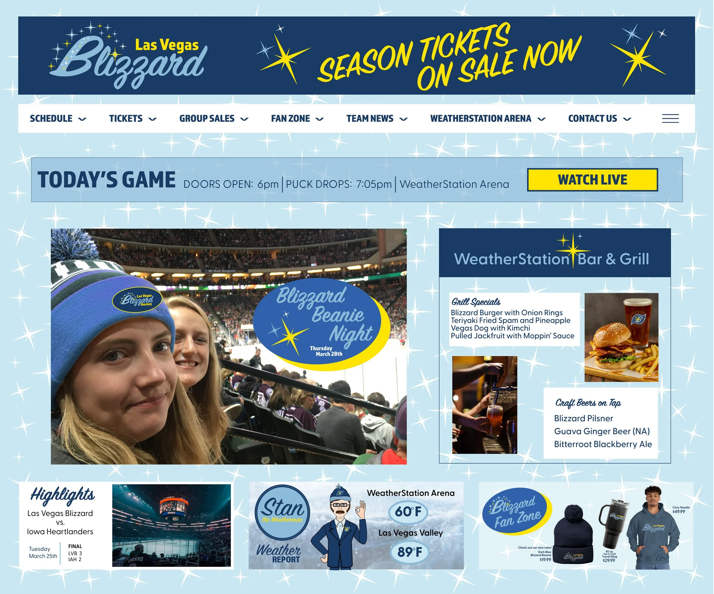
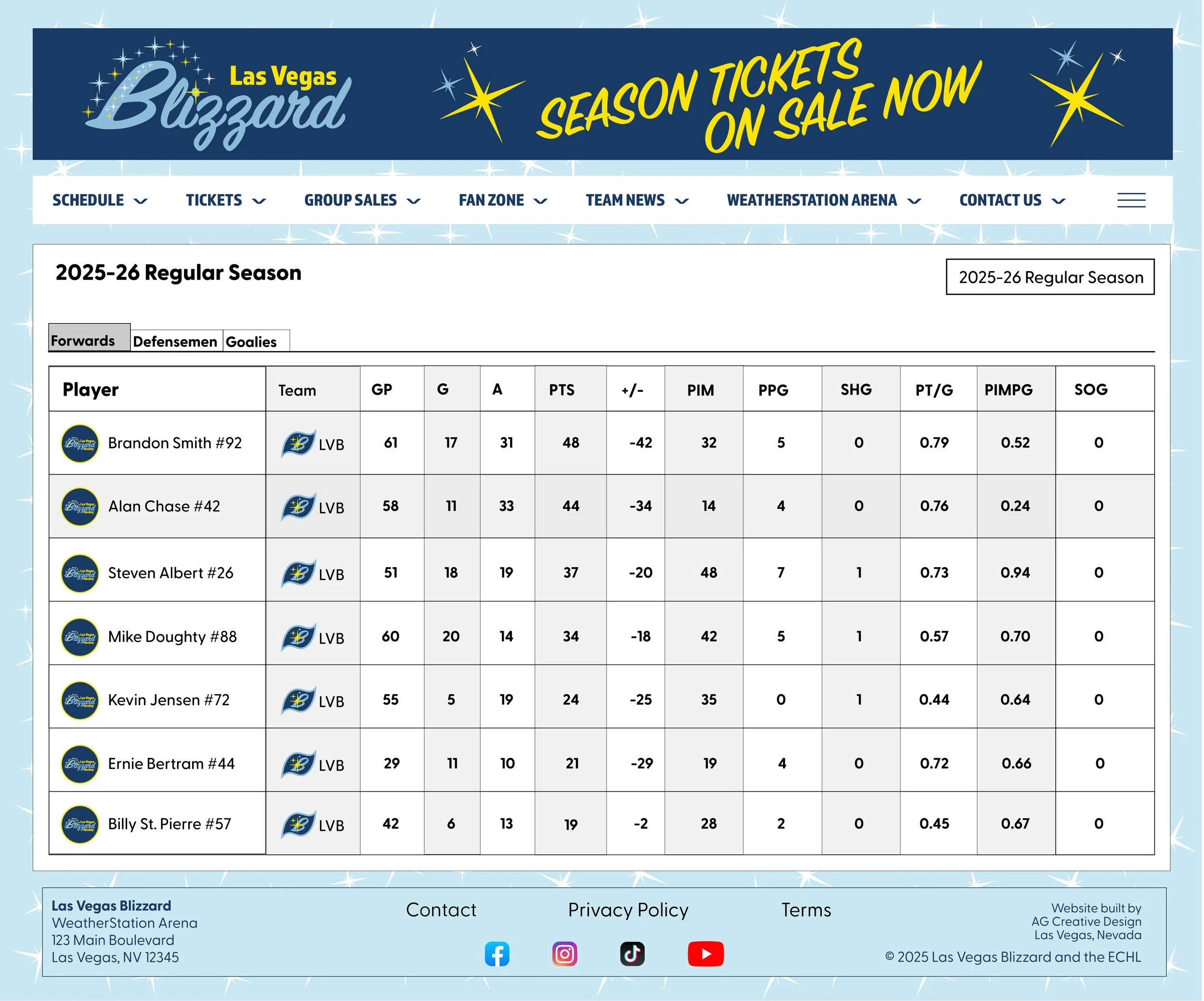
The landing page of the website was redesigned to create a cohesive look across all platforms and paper assets, like the letterhead. The second page is still a listing of the stats and player information that is available from the ECHL database.
Final Website
References
American Psychological Association. (n.d.). Need for affiliation. APA Dictionary. Retrieved on 5/10/25 from https://dictionary.apa.org/need-for-affiliation
Anglingdarma, D. (2025, Apr 16). Exploring the 1950s Atomic Age design: A journey into mid-century futurism. Kittl. Retrieved on 5/17/25. https://www.kittl.com/article/atomic-age-design-guide-asp
Arapovic, B. (n.d.). Ice hockey player in action. Vecteezy. Retrieved on 5/17/25. https://www.vecteezy.com/photo/11923741-ice-hockey-player-in-action
Are hockey games cold? A comprehensive temperature guide. (2025, Feb 11). HockeyMonkey. Retrieved on 5/17/25. https://www.hockeymonkey.com/learn/what-is-embroidery-in-hockey-a-comprehensive-guide-duplicated#:~:text=On%20average%2C%20temperatures%20inside%20a,F%20(4%C2%B0C).
Feldberg, S. (n.d.). Vintage Vegas: A retro travel guide to Sin City. Travel Nevada. Retrieved on 5/17/25. https://travelnevada.com/travel-guides/vintage-vegas-a-retro-travel-guide-to-sin-city/
George, A. (2024, May 10). The secret color formula for a stunning mid-century modern color scheme. Edward George London. Retrieved on 5/17/25). https://edwardgeorgelondon.com/mid-century-modern-color-palette/
Inoue, Y. (2019, Apr 2). Building community through sport. University of Minnesota Newsletter. Retrieved 1/19/25. https://twin-cities.umn.edu/news-events/building-community-through-sport
Nordquist, R. (2025, April 29). Definition and examples of epenthesis. ThoughtCo. Retrieved on 5/17/25. https://www.thoughtco.com/epenthesis-word-sounds-1690605
SmartSign. (n.d.). A short history of the ‘Welcome to Fabulous Las Vegas’ sign: Second in a SmartSign blog series on famous signs and their origins. Retrieved 2/9/25. https://www.smartsign.com/blog/short-history-welcome-fabulous-las-vegas-sign-second-smartsign-blog-series-famous-signs-origins
The effect of fonts on readability: How distance influences read. (n.d.). Meadow Outdoor Advertising. Retrieved on 5/17/25. https://www.meadowoutdoor.com/creative-services/design-guidelines/fonts